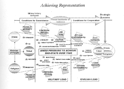
This is a PowerPoint slide from "an official Central Command briefing depicting how the United States intended to progress from 'military victory' to 'strategic success.'"
Before commenting on this horror, I have to make a confession. For several years during the late Eighties and early Nineties, I ran a corporate communications graphics and pubs shop for a Beltway Bandit in the Washington suburbs, during which I came to detest Microsoft's PowerPoint with a hatred I reserve for few things in this world -- it falls somewhere between my loathing for Dick Cheney and Virginia Senator George Allen. But my confession is this: I too have perpetrated information-design horrorshows like the one above. In my defense, the ideas didn't come from my own head but from pointy-haired bosses whose lives depended on communicating with military procurement officials -- and here's the important part -- in their own language.
And above you see the language that these people speak. My sudden, unexpected reimmersion into the clouds of toxic methane and voice-ensqueakening helium emitted by a DOD PowerPoint deck was what sent me scurrying under the bed, promising to be a good boy and never anger Mommy again.
Now, to the PowerPoint graphic itself.
First, let me say, that although it's unrelievedly ugly, stuffed with Tuftean "chart-junk" like meaningless grayscale fades and pointless drop-shadows, dismally unimaginative default typefaces, and hilariously underthought all-caps Pentagon-ese ("aimed pressure to achieve end-state over time"), the chart isn't completely incomprehensible. In fact, a reasonably well crafted paragraph will summarize every point made in the chart. Let's try a retranslation:
The difficulty we will face upon invasion will be a division of the people of Iraq along ethnic, tribal and religious lines. Our task will be to reduce these divisions to form a cohesive whole, which will, in theory, lead to a healthy democratic society. Our expectation is that once we are able, through improved policing procedures, to reduce the incidents of violence attendant on invasion, what was once mere coexistence will lead to cooperation and strategic success. We expect the occupation to occur in three phases: first the invasion itself; a second period in which the US military will govern the country; and a final phase in which Iraqi civilians will assume leadership. During the first phase, we will establish a visible presence and assume responsibility for security and stability. In the second phase, the combined forces of CENTCOM and the Joint Task Force-Iraq will apply pressure to form a government, begin reconciliation among local authorities, and continue to provide stability. In the final phase, responsibility for this pressure will revert to the civil authorities, and we expect a civil society to emerge, and the ethnic, tribal and religious tensions to abate.And we all know how well that turned out.
The problem with the Pentagon PowerPoint graphic is this: It reduces the monstrously complex problem of invading and occupying a nation-state to a (gigantic, tortured, overwrought) visual metaphor. Those ugly-assed arrows, representing CENTCOM, JTF Iraq and so forth, make the application of "pressure" on the forces of disorder look like some kind of marvelous deus ex machina that will somehow magically turn the centrifugality of post-invasion anarchy into the centripetality of pre-democratic order. That visual metaphor, on first glance so imposing, so inevitable, is in reality a deeply evil and dissembling disguise.
Look again at my paragraph summarizing the graphic. It's absolutely full of holes, of logical lacunae. Are those the true dividing lines in Iraq society, or are the tensions and loyalties more complex than that? What does this "pressure" consist of? What if there is resistance? What is the mechanism by which forced coexistence leads to cooperation? What if the Iraqi civilian leadership has ulterior motives in presenting itself as such? How is reconciliation among local governing forces going to be achieved? How does the newly constituted civil authority view this unearned responsibility for continuation of US military policy? What if there aren't enough troops?
The guys we got running the joint are busy, busy people. They've got no time for reading a paragraph of the complexity I just presented. They need it boiled down, they need it condensed, so they understand your point in a quick glance. You present Rummy with a graf like that, he's gonna throw your beautifully crafted prose out the window of his limo, you overheated stripey-pantsed Ivy-League pinhead! When you're ushered into his presence, you've got eight seconds to get his attention, and if you don't grab him by the short-and-curlies in that time, he's gonna rip your head off and piss down your neck!
Do you expect Rummy to brief the President of the United States with that shit?
Others have blamed PowerPoint itself for the stupefaction of American government. I won't go that far -- software can't make you do anything you weren't already going to do. The simple fact remains that the logical holes in my prose paragraph went unchallenged by the very people whose entire function it is to issue those challenges. They bought the graphic, not the paragraph.
I don't blame PowerPoint. I blame a country that interprets intellectual laziness as "swagger." I blame a country that allows PowerPoint presentations to substitute for actual verbal discourse at the highest levels of government and commerce. I blame a country that rewards incompetence, that expects less and less engagement in inconvenient detail the higher you ascend the ladder -- the higher you go the less you're expected to know -- until you reach the pinnacle, where the mighty and revered godhead knows absolutely nothing at all.
14 comments:
The medium is the massage, right? I agree about the difference between the paragraph "cause leads to effect" and the image Cause [big arrow with a drop shadow filled with yellow-to-orange vertical gradient] Effect.
I like the effect of the little stars for bullet points, though - subliminally invoking both profitable munitions sales for the defense contractors and promotions ofr the military brass.
And has anyone ever successfully made a curved arrow in PowerPoint?
I can just picture Georgie, handed this graphic by Rummy as he in turn gets his eight seconds to impress Dear Leader. W, immediately grasping the plan depicted says, "So we put the squeeze on 'em 'til they work together?" And Rums, of course, says, "You got it." And they both smile.
BTW, it's been documented that eight seconds is exactly the length of W's attention span.
Presentation Zen at http://presentationzen.blogs.com/presentationzen/2006/08/powerpointifica.html has some good things to say about this in particular and presentation in general.
You got a problem with George Allen, macaca?
His attention span and depth of knowledge are undoubtedly even shorter than Dubya's, so who could be more qualified to ruin, er, run the country in '08 and beyond?
I make powerpoint presentations for the military, and they're still making them like that. I got goosebumps looking at this slide, thinking, "they make slides like this over the whole military?"
arrows, pressure, failure: it's a nice metaphor.
those small arrows push inwards, forcing the whole process to the glorious right-side goal, where all will be well. but if one (or more) of those arrows isn't strong enough to push its share of the process inwards, the pressure in the system caused by the rest of the arrows will cause the whole thing to burst, rupture, herniate at the point where the weak arrow failed. and the guts will spill out onto the floor. and the doctors will get their shoes dirty. but that's ok, beacuse they have other shoes.
sorry for the double.
damn the internets.
That visual metaphor, on first glance so imposing, so inevitable, is in reality a deeply evil and dissembling disguise.
I think you just won the All-England Summarize Derrida Competition.
Fellow haters of Powerpoint are advised to check out The Gettysburg Powerpoint Presentation.
--nashtbrutusandshort
Categorical Aperitif
Actually I think that it rather successfully illustrates Bush as a uniter. These seperate forces have all been effectively funneled right up the ass of Amurika....
That's putrid. We're so fucked we're out of th' cigarettes afterwards and we're chewing couch filling.
Remember when they were pushing Bush as th' "CEO President" like that was an actual selling point?
I have a great idea for a guest blog now, though.
Though with typical Frat boy selfisness... Absolutely no plan for a reach around, a gentle word ashared smoke.... I guess we are left chewing the cushions....
So little has changed. I used to make overhead slides for military briefings in the longago, and they looked remarkably similar to this nasty PowerPoint image.
The main difference was that I created them with colored adhesive cels, an Xacto blade and rub-down lettering, very, very slowly.
The holes in the logic have always been there. They've just gotten a WHOLE lot bigger.
And W is the ultimate clueless commander. We're all fucked.
Yeah, Wren, I got into the game right at the beginning of the Desktop Publishing Revolution, and I still have in my files an overhead foil from my predecessor in the job. It was an amazingly laborious task, with rub-on arrows, type set either with the Letraset rub-on or by sending manuscript out to a photomechanical typesetter and then carefully pasting it in place. You'd think the amount of work would have allowed the creator to do a lot of thinking about the subject matter -- not to mention a great deal of economy in the execution. But -- and that's a big but -- the artist and the author were never the same person.
And yes, we are SO fucked.
Post a Comment